 Muser Studio
App development for iPhone Duo
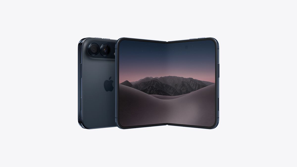
“It’s just an phone that folds, right?”
iPhone Duo, eh? Funny how this seems like a simple thing to deal with. Simple, until you think about it. Rather than just concerning yourself with which way up the phone is, it’s that, multiplied by whether you are looking at the outside or inside, multiplied by whether the device is partially open, or fully open like an iPad? For example if it’s partially open, is it like a book or a laptop you’re looking at the inside. Or is partially open like a tent/desk planner with you looking at the outside. These are questions of the amount of openness, direction, and orientation.
But let me back up. Why would I (or you) be affected by this?
How custom is custom?
Well, it was definitely fun to reinvent UI ideas using inspiration and concepts I’d picked up from my Marvel movie visual effects days. For example Muser Audio even has some Spiderman/Iron Man influence in it (see if you can spot it).
But for all of the fun to be had from these little flourishes, there is a cost. And I don’t just mean creating a set of OpenGL shaders, a bespoke exporter from Houdini to the OpenGL render pipeline, animation structures etc.. There is something that I didn’t properly account for that is far more costly: the users’ attention span.
The cost
Something I realised, that might be useful to you if you’re starting out in designing things for the public: learning takes time and energy. And I don’t just mean yours. I’ve noticed that expecting people to be perennially in the mood to study how to use something is unrealistic. There’s a reason why it’s a safe bet that >85% of the purchases you’ve ever made had you using it before even glancing that the manual was there. Factor in the impatience that comes when someone has limited time, and steepness of the learning curve just seems like a wall. How this relates to UI design is actually fairly obvious - yet it managed to elude me for a while.
What does a “record” button look like?
Before you finished reading that last sentence your brain probably conjured up an image of a red circle. And there’s a reason for that. It’s been a red circle for decades, before phones, before digital audio. What a about stop? A square yes? Play, a right pointing triangle, probably green. You get the idea.
When I started to think about what my app is presenting to a user I realised I was demanding a lot of learning or for them to have prior knowledge that they likely may not have. This was the topic of my recent self-reflective post.
After a painfully honest chat with my good friend (and all-round musical genius and C++ mentor) Dave Elton of Ursa DSP, I resolved to think of my apps differently. The challenge: “how to reduce the seconds between user enters the app, and user gets a result?”
I realised many features I need and rely on, like the metronome, might not be the first thing a new user cares about on first run. Another example of something that foxed people was how Muser Studio needs you to start recording your session before you can start marking loops on the fly. Suddenly that red circle has an additional meaning that the user wasn’t thinking of.
Hard to make easy choices
The alternative to all my bespoke UI self-indulgance is simply: use the UI tools Apple provide. I shied away from them for ages, as oddly, it felt like cheating. Then they brought out liquid glass, which kind of annoyed me as it was pretty much the look I wanted to design myself for my next UI. My reaction is pretty funny, looking back - to reject rather than embrace simply because I hadn’t made it myself. Ego, much?
Critically, my objective had changed. I now was less concerned with going all Frank Sinatra, building a UI my way, and more focused on the users time before result.
Then came the Duo
Conveniently hardcoding C++ based UI components to a portrait framing slab-phone is one thing. Supporting a myriad combinations of openess, direction, and orientation is entirely different. Based on my experience I am now of the opinion that not leaning on Apple’s SDK for this techno-contortionistic chaos is straight-up martyrdom. And for no good cause.
So, fine. A Swift based UI is it? Reworked to get people looping more easily? And maybe throw in timeline representation too? What the trifecta is this? Watch this space!

v1.0.32 is available now for iOS
No comments yet - be the first!